Pages

Friday, September 30, 2011

Pottery Barn Side Table Makeover

I had my first experience with my new shipment of the highly-anticipated, Annie Sloan Chalk Paint, and it was a success! 


I found the paint to be very workable and forgiving, and this is coming from someone with limited experience painting furniture.  I tried not to read too many reviews on the product (everyone raves about it), because I didn't want it to influence my opinions.  But I have to say, I will definitely continue to use the paint, despite the hefty $35-a-pint price tag. 


Here is a picture of the piece in progress.   This is what the piece looked like during the first application of Annie Sloan's Country Gray.


As you can see, one coat allows the color underneath to show through.  The paint was developed to provide a great deal of versatility.  According to Annie Sloan's website, the paint can be diluted with water to create a "wash" of color.  The paint can also be thickened by allowing it to set overnight with the paint can opened, which will provide a textured effect.


I will provide a more detailed product review in an upcoming post, but first, I wanted to share the finished product with you.  I just love how the Pottery Barn side tables turned out.  


Here is a picture of one side table before.


And the end result.


The color I chose was Country Gray.  It is almost a pale, pistachio green.  The paint dries in a soft matte finish shown above.  When you wax it (recommended), it turns slightly darker with a subtle sheen.  The proprietary wax also offers versatility when distressing the furniture, while providing some protection.  


I chose not to distress these side tables because I loved how pretty they were in one solid color.  I am just going to let the pieces distress naturally with normal wear and tear. 


I dressed these babies up with some gorgeous, vintage-inspired drawer pulls purchased at Anthropologie.  They have an incredibly unique selection of hardware.  It can get pretty pricey, but I was able to purchase these pulls for $8 each.  They are the jewelry, after all.  Since I only needed four, it was worth the extra splurge.


I also lined the drawers with some linen wrapping paper purchased from World Market for just $3 a roll.  This was a huge upgrade from the standard shelf liners, and it's cheaper too!  


I measured the sides and bottom of the drawer, and cut the paper to fit as shown here. 


I adhered the paper to the drawers using a spray adhesive.  I had Elmer's Spray Adhesive in my arsenal, but there are several different brands.  It is holding up OK so far, but I think next time I will use a stronger bonding agent such as Mod Podge.  If you go the spray adhesive route, make sure you lay a cloth on your surface prior to spraying. Then attach the wrapping paper to the inside of the drawers, making sure to apply enough pressure to eliminate any ripples.  


So there you have it.  These side tables will be right at home in my newly-painted guest room/office.  I love how the room is coming along.  I can't wait to have my own sanctuary to sip my morning coffee. 


Let me know what you think!  

Wednesday, September 28, 2011

Mother Nature Strikes Again - Literally

What a crazy week it has been already.  Hubby is in Miami for business, and I am home with two sick kiddos.  I guess its Murphy’s Law—they seem to get sick every time I am home alone.
But I am not letting that keep me down – no ma’am. In fact, I realized how much more productive I can be when home alone.  I have to keep myself busy, otherwise it feels awfully lonely in this big ‘ole house.

Not to mention, we had a huge thunder and lighting storm that caused a power surge in the upstairs bathroom.  The kids and I were in the kitchen having dinner, when I heard a huge crash.  Immediately, the smoke alarms triggered.  I thought surely the painfully ear-piercing sound would send the children into frenzy.  They were surprisingly calm.

I was certain the house was hit by lightning (I was right), and immediately tried to gather my senses and stay calm for the kids.  I looked upstairs, and glanced outside for any signs of smoke, but I couldn’t see anything.  I noticed the upstairs smelled like something was burning.  I didn’t waste any more time, and immediately called 911 to send the fire department.

It appears the lightning struck somewhere on the roof.  We are so fortunate the house did not catch fire.  A nearby neighborhood was struck with a bolt of lightning that burned down the entire movie set of the Alamo, in addition to starting a fire that spread 200 acres.  It is devastating the destruction we have had from wildfires the last few weeks.  My heart goes out to the local families and businesses affected by the recent disasters.

Here is the picture of the bathroom, post-storm.  Sorry for the dark picture but, there were no lights after the blowout. There was some minor damage, but overall, nothing major.  Needless to say, it could have been much worse.
I see more painting in my near future. Any suggestions?  This bathroom is screaming for some color.  While I am at it, I will certainly change the hideous builder-globe.  Yuck!
On a lighter note, my shipment of Annie Sloan Chalk Paint arrived last week, and I have been dying to start experimenting.  I chose Country Grey, and the standby, Old White.


Here is a sneak peak of the piece of furniture that I will be repainting.
Stay tuned for the transformation.  I have a set of these Pottery Barn pieces that I (over) paid for a couple years ago.  And they have been darkening up my guest room ever since.  I can't wait to make them over, and share pictures of my new guest room/work space.

Monday, September 12, 2011

DIY: Sake Bottle Planter

Hi All! I thought I would share a simple project that I did for a friend over the weekend.  You can do this simple DIY project in less than 30 minutes. 

I went out to dinner with my in-laws and hubby at a fabulous Japanese fusion restaurant a couple months ago.  Of course, Japanese cuisine would not be complete with out sake.  When they delivered the frosted pink bottle to the table, my mother-in-law commented on how pretty it was - too pretty to leave at the table to ultimately end up in the trash.


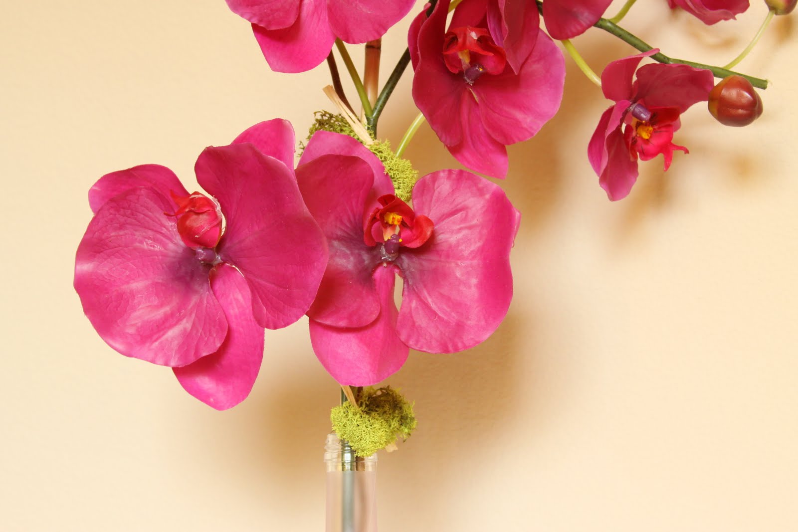
I just love everything about this bottle - the cotton-candy-pink color, shape, and particularly, the artistic label. We just had to order a second bottle for each of us to take home.  I thought it would make the perfect flower vase on a bedside table.  I made one for my friend Lauren, and she liked it so much, she asked me to make another!  Check out the end result...


This planter couldn't be simpler.  I started with a fuchsia Phalaenopsis orchid stem which I purchased from Michael's for about $9.99.  Using heaving duty wire clippers from hubby's collection, I clipped a few inches from the orchid stem to achieve the desired height.  I attached the orchid stem to a bamboo reed using some floral wire.  You can trim the top of the bamboo reed so it extends a couple inches beyond the top of the orchid.  

One simple trick to adding some detail to a store-bought arrangement is to secure a touch of high-quality moss to the stem using some raffia.  You can tie it to make a simple loop, or leave the edges frayed for a casual look.  Secure the moss to the stem with a touch of hot glue.   

I completed to the look with a simple stem of curly willow, and voila! A simple Sake bottle planter. 


Hope you like!


Thursday, August 18, 2011

Mateo's Dresser Re-vamp

Hi my name is Jamie, and I....am a procrastinator (sigh).  It could be much worse, I guess.  Everyone has the laundry list of things they need to improve on.  Here are my top five in no particular order of importance.

#1 Be less cluttered.  I am sort of a neat freak, and my husband is the sort of self-confessed OCD type.  I am what you would call a piler.  In my attempts to organize my paper clutter, I create so many "organized" piles that I completely disorganize myself!  Hubby is convinced we need a larger countertop, but I assured him it would just give me more space to scatter things.

#2 Have more patience.  In life. In general.  With my family, particularly my three-year old. Enough said.

#3 Laugh more and stress less. Stress is so hard on the body, and there is nothing like a good, full-belly laugh to ease that tension.  At the end of the day, as long as I have my health and my family, I am a lucky gal.

#4 Take more pictures.  My kids are growing like weeds right in front of my eyes. I want to capture everything - the good the bad, the hysterical...that's the good stuff.

#5 Don't put off until tomorrow what you can do today. This is the inspiration for my blog post.  And let me tell you, there is nothing like a house full of guests to kick a sista' into high gear.

My brother just informed me that he and the family - my two nieces, one nephew, and my sister-in-law - would be driving down to Austin to visit us for a few days (pause for screech of excitement).  I can't wait to see my family.  This also coincides with two other guests traveling from Peru.  Seven house guests calls for a major organizational overhaul.

My three-year-old, Mateo, has been in desperate need of a dresser for quite some time.  We recently relocated Mateo's dresser/changing table to Baby Luca's room, and upgraded Mateo to a big-boy bed.  Needless to say, I was in desperate need of storage.

My in-laws purchased a dresser on clearance from the Pottery Barn outlet for our guest room. It was marked down to final sale because it was missing one drawer in the center. As you can see, the dresser was pretty simple.  Although we tried to replace the drawer with a dummy front made of plywood, the finish never matched up.  Hmmmm...sounds like a perfect guinea pig for my first attempt at refinishing furniture.

Pottery Barn Dresser Before....zzzzzzz

And here is the dresser after my transformation.


Pottery Barn Dresser After

Here is how I did it.  I have been reading an incredible DIY/home decor blog from Kate, a.k.a. Centsational Girl.  If you have never stumbled upon her blog, you should check it out...like immediately.  She is incredible, and her DIY projects look really professional.  I am extremely picky when it comes to DIY style.  I love the idea of DIY projects, but I don't want it to look as if I came close, but didn't quite get there.

I did some hefty research on Kate's website before attempting to tackle this project. She has run the gamut on a whole slew of household projects, and has painted just about anything you can think of.  Kate also lists all of the products she uses, so I used her blog as a resource for this project. Since my in-laws purchased the dresser, I had to make it look better than before, and replace it with a better piece for the guest room.  Stay tuned, because I have big plans for a replacement piece (so excite!).

Because this piece of furniture is for a very energetic and spirited three-year-old, it needs to handle a beating.  I decided to use an oil-based paint for its superior coverage and durability.  My product of choice was Rustoleum's Smoke Gray in gloss finish.  The color reminds me of an old-school locker room. It's actually more of a slate blue than gray, so it is a nice contrast to some of the more juvenile primary accents in his room.


One thing I have learned from painting, is preparation is 90 percent of the job.  If you really want something to look professional, you must do the tedious prep work - take out all of the hardware, and fill the holes with a wood filler using a putty knife if you are replacing the hardware, and cover any scratches.  I used Elmer's wood filler.  Sand lightly over any patches to ensure a smooth finish.

I prepped the furniture all over with a light scuff using medium-grit sandpaper, followed by a coat of Zinsser's Cover-Stain Primer.  Note: Zinsser claims it will cover without sanding, but according to Kate, it doesn't hurt to give the primer a little something extra to adhere to.  I used 120 grit sandpaper. After the primer dried, I used a foam roller to apply the paint.  I immediately followed with a high-quality, 2-inch angled brush to get in the corners and smooth any drips.


Let me tell you, Texas heat is no joke. I started painting around 9 a.m, and I still had trouble with the paint bubbling while outdoors. I think next time I will lay down a drop cloth and paint inside. It was definitely challenging to apply the paint evenly before it started to dry and bubble.


Another trick I picked up from CG is to use something to prevent brushstrokes.  She recommends using Floetrol for latex paint and Penetrol for oil-based paints.  I actually used mineral spirits, which is basically low-odor paint thinner because I needed it to clean my paint brushes anyway.  It worked OK, but I will definitely try the Penetrol next time to make a comparison.  I wouldn't have been able to continue working without the mineral spirits - otherwise, the paint was getting all funky gunky.


Normally, one should do a light sanding in between coats of paint, but I skipped this step because it was removing the glossy finish, and giving the furniture a more distressed look.  I actually like that look too, but I decided to go for smooth and glossy this time.   I waited about 2 hours per the instructions, and applied the second coat of paint.  I let this cure over nigh,t and followed it with two coats of Minwax Polycrylic in gloss finish.


The final touch was the hardware.  I looked at Lowe's, and was completely underwhelmed with my hardware selection.  I intended to replace the original knobs with something a little more vintage-looking, but nada.  Back to the paint isle I went.  There wasn't a great selection of colors, but there was quite a variety of finishes.  I decided to do something metallic via Rustoleum's Bronze Metallic finish.


I am so glad I didn't replace the hardware.  For the roughly $8, I spent on a can of spray paint vs. $30 plus for new hardware,  I transformed the knobs.  Don't you agree?


Now that Mateo's dresser is complete, I can move his CD player back into his room. I miss our dance parties.  Little by little, his big-boy room is coming together.  In the meantime, here is a sneak peek of his vintage-inspired room. It's never to early to start teaching him style, but I also want his room to be a reflection of all the things he loves.  For the time being it's trains, cars, motorcycles, and robots - basically anything that makes noise or goes fast...surely, his father had no part in this. Coming from a racing family, and a husband with a Ducati, I am afraid I may be doomed...


Do you have plans to transform a piece of furniture, but are too timid to tackle it on your own? Armed with the right tools and information, you can't lose. And your wallet will thank you.

Friday, July 29, 2011

Accessorizing 101: Fireplace Mantel

I had a request from one of my readers, (shout out to Angie!) to post something on how to successfully decorate a fireplace mantel, display family photos, and decorate a wall with high ceilings.  These are really common questions.  One thing I can say about accessorizing is that it takes practice to get it right.  There really isn't a right or wrong way when it comes to design, but there are some guidelines to achieve that look that you see in the magazines.

I thought I would do a series of three posts, starting with the Fireplace Mantel.  First, decide if you are trying to create a look that is formal or casual.  If your mantel is in a sitting room that is rarely used, perhaps you want to go with something that is a little more formal-looking.  If your fireplace is located in the family room, where the kids and guests regularly congregate, you can do something a little more casual.

When I think of formal fireplace arrangements, I think of symmetry.  For example a large statement piece in the center such as a mirror or a large piece of artwork, flanked with candles or  topiaries. I love this fireplace example from Martha Stewart.  It's simple and elegant, and the greenery gives it a touch of asymmetry to an otherwise symmetrical display.


Here are a couple of examples of asymmetrical fireplace mantels from REAL Simple.  I love how unfussy the look becomes.  Both are interesting, and the selection of objects is really artistic.  If you are going for this look, be sure that your accessories have some whimsy to keep it from being too serious.


I used to place everything symmetrical because I wasn't confident in creating an asymmetrical look that worked.  If you practice, you will eventually be able to create a look you love without over-thinking it.  Here are some general guidelines for creating a juxtaposition, or a grouping of objects.

  • Group Similar Objects:  When grouping objects, choose items that share the same color, shape, theme.  This will create a more unified look so that it doesn't appear as clutter.  
  • Rule of Three: There is a theory that three is the magic number when creating a small group of objects.  Things tend to look better in odd numbers - for example, a single stand alone item such as a large framed artwork, or a grouping of three candles or ceramics.
  • Vary the Height of Objects: You can create more interest if you group objects with different heights.  Pairs of objects at the same height can appear monotonous.  If you have smaller objects, try to raise them on a pedestal or stand so they don't get lost.
  • Create Depth: Placing objects in a straight line looks static.  I like to place three objects in a triangle, or place one single object next to two staggered items.
  • Choose a Focal Point: Try to arrange everything around one main object such as a mirror, or artwork.  This will pull everything together.  If you find that you have too many items, you can take away while maintaining a focal point.
  • Edit, Edit, Edit!: You may have to add and subtract several times before you get it right.  Be selective with your accessories, and you will pull together a pleasing arrangement without looking cluttered.
Oh, and one more tip, mirrors are always a popular above a fireplace mantel.  A mirror is a great way to bring more light to a room, and they come in endless sizes and shapes.  If you have high chimney with tall ceilings, you can play up the architecture with a large mirror.  

When displaying a mirror, make sure that the reflection is a pleasing one - you don't want a mirror reflecting a bare wall.  Position a mirror to reflect a gorgeous chandelier, a view to the outdoors, or a pretty floral arrangement. 


My advice is to page through magazines, and books for inspiration and try some of the ideas out on your own.  Here are a couple more that inspire me:


Monday, July 18, 2011

Decorating with Feng Sui

I am dedicating this blog post to my good friend, Lauren.  Today I asked her, "if you were to go on a design blog, what would you be looking for?"  She answered, "furniture layout - how to make the best use of a space, and promote positive energy."  This leads to the discussion of Feng Shui (pronounced Fung-Shway), and we both decided we need to Feng Shui our homes... and our lives...for that matter.

Most people are vaguely familiar with this ancient Chinese study.  But I wanted a dummied-down version, without all the technical jargon.  I went to Barnes & Noble and purchased Feng Shui for Dummies, so I could brush up on my principles, and share with everyone the basic guidelines for decorating with Feng Shui.  It doesn't get much simpler than this, folks!

Before I get to decorating tips, I have to touch on the the fundamental concepts of Feng Shui: yin and yang, and the Three Realms of Influence.  The ancient Chinese determined that the universe was composed of complementary energy principles - yin and yang.  You probably recognize the yin-yang symbol - it looks like two fishes - one black and one white, that interconnect to form a circle.

The yang is the white fish, and it represents the active side of nature - characteristics such as bright, hard, loud.  In contrast, the black fish or yin, represents passivity, silence, receptiveness, darkness and inwardness.  All things contain relative amounts of yin and yang energy.  The ultimate goal is to achieve a balance of yin and yang energy resulting in peace and harmony.

Chinese philosophers assigned three categories into which the yin and yang flowed - heaven, Earth and Human. These are recognized as the Three Realms of Influence. The philosophers studied many generations to discover how the categories could be manipulated to improve fortune, destiny and personal relationships.

These principles are the essence of Feng Shui.  You can achieve a harmonious environment by considering these principles when selecting the layout, color scheme and furniture for you home.
Many facets of interior decorating implore the ancient philosophy of Feng Shui.  You have to know the rules before you can break them!

Here are some basic tips for enhancing your home with Feng Shui principles.

  • In the interior of your home, the position of the bed is the most important aspect.  Create a commanding position in your bedroom by facing the bed as far away from the door as possible.  This asserts control over your space and your life.
  • The position of your master bed should allow the sleeper the largest view possible, as a diminished line of sight can reduce the sleeper's purpose and life vision.
  • You should be able to clearly see the bedroom door from your sleeping position; if you are lying on your back, you should be able to open your eyes, and immediately see the door without repositioning you body. Blocking the view to the door can leave the sleeper on edge.
  • Give careful thought to the quality of your bed, as it is the single most important piece of furniture in your home.  A new bed supports positive energy and vitality.  A used bed (from a previous owner), can create a lack of energy or lead to illness.
  • Seating positions in areas that are primarily used for socializing, such as the living room, should be conducive to conversation.  Try to create seating arrangements that allow groups of two to five people to converse in one area.
  • Avoid placing a major piece of furniture with the back facing the doorway.  Allowing guests a clear view of the doorway will make everyone feel safe and comfortable.  
  • In a home office, the position of the desk is critical.  Create a commanding position with your desk by making sure it is as far from the door as possible.  This gives you more control over your space, and conveys confidence.
  • Do not place the desk in the direct path of the doorway, and do not to have your back against a wall of windows if possible.  This can create some vulnerability, but is still acceptable.
  • Throughout your home, avoid furniture that dominates the space.  This can make less room for you and your energy to flow; it can hold you down and can be depressing.  Downsize large, heavy furniture for space saving solutions.
  • And lastly, cleanliness is next to godliness - a clean home provides you with clean energy to stay happy and healthy.
If you have a challenging floor plan, there are many remedies to the Feng Shui principles listed that can help reverse the negative energy in your home.  I recommend bringing Feng Shui principles to every room you inhabit.  The result is a home that feels as good as it looks. 

Thursday, July 14, 2011

Debut: Jamie Figari Design Custom Floral

I am excited to share a few of my custom floral arrangements.  I started making arrangements on a fluke.  I have always loved orchids, but am always disappointed by the arrangements at the department stores.  Not only are they usually very artificial looking, they are severely overpriced.  I  would love to fill my house every week with real flower bunches, but it becomes very expensive.

The first arrangement I created was a three-stem orchid planter.  I found the beautiful brass bowl at a vintage store in Austin while shopping with mom.  I fell in love with the bowl right away, and knew exactly what I would do with it when I got it home.  The arrangement turned out so well that I started making a few more, until soon after, my house was full of flowers!  


I love the creative process of making floral arrangements.  I can start out with one idea, but when I start putting something together, it often takes on a new direction.

I have hand-selected each flower to ensure each stem is as realistic as possible. I want people to look two or three times at the flowers to see if they are real. Another aspect that makes my arrangements truly unique is the container.  I scour thrift stores and vintage shops looking for one-of-a-kind vases that can be upcycled into planters for my flowers.  This orchid is perfect example of a thrift store find that has been transformed into a pretty flower pot.


This is a tulip arrangement that I created for a more contemporary look.  I wanted to do something a little different than what you normally would see in a store.  I think this would look lovely on a nightstand in a bedroom, or up against a mirror in an entryway.  The curly willow and the gray pebbles give it a fresh and modern look.  


Please contact me if you are interested in having a custom arrangement made for your home or office, or if you are interested in an item featured in this blog.  Both the single orchid and the tulip arrangement are available, and I can ship anywhere in the U.S. I can create a custom arrangement to suit any decor ranging from traditional to contemporary.  

This is just the beginning.  I am constantly creating new pieces each week, and can't wait to share them with you!