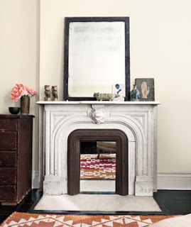
I had a request from one of my readers, (shout out to Angie!) to post something on how to successfully decorate a fireplace mantel, display family photos, and decorate a wall with high ceilings. These are really common questions. One thing I can say about accessorizing is that it takes practice to get it right. There really isn't a right or wrong way when it comes to design, but there are some guidelines to achieve that look that you see in the magazines.
I thought I would do a series of three posts, starting with the Fireplace Mantel. First, decide if you are trying to create a look that is formal or casual. If your mantel is in a sitting room that is rarely used, perhaps you want to go with something that is a little more formal-looking. If your fireplace is located in the family room, where the kids and guests regularly congregate, you can do something a little more casual.
When I think of formal fireplace arrangements, I think of symmetry. For example a large statement piece in the center such as a mirror or a large piece of artwork, flanked with candles or topiaries. I love this fireplace example from Martha Stewart. It's simple and elegant, and the greenery gives it a touch of asymmetry to an otherwise symmetrical display.
Here are a couple of examples of asymmetrical fireplace mantels from REAL Simple. I love how unfussy the look becomes. Both are interesting, and the selection of objects is really artistic. If you are going for this look, be sure that your accessories have some whimsy to keep it from being too serious.
I used to place everything symmetrical because I wasn't confident in creating an asymmetrical look that worked. If you practice, you will eventually be able to create a look you love without over-thinking it. Here are some general guidelines for creating a juxtaposition, or a grouping of objects.
- Group Similar Objects: When grouping objects, choose items that share the same color, shape, theme. This will create a more unified look so that it doesn't appear as clutter.
- Rule of Three: There is a theory that three is the magic number when creating a small group of objects. Things tend to look better in odd numbers - for example, a single stand alone item such as a large framed artwork, or a grouping of three candles or ceramics.
- Vary the Height of Objects: You can create more interest if you group objects with different heights. Pairs of objects at the same height can appear monotonous. If you have smaller objects, try to raise them on a pedestal or stand so they don't get lost.
- Create Depth: Placing objects in a straight line looks static. I like to place three objects in a triangle, or place one single object next to two staggered items.
- Choose a Focal Point: Try to arrange everything around one main object such as a mirror, or artwork. This will pull everything together. If you find that you have too many items, you can take away while maintaining a focal point.
- Edit, Edit, Edit!: You may have to add and subtract several times before you get it right. Be selective with your accessories, and you will pull together a pleasing arrangement without looking cluttered.
Oh, and one more tip, mirrors are always a popular above a fireplace mantel. A mirror is a great way to bring more light to a room, and they come in endless sizes and shapes. If you have high chimney with tall ceilings, you can play up the architecture with a large mirror.
When displaying a mirror, make sure that the reflection is a pleasing one - you don't want a mirror reflecting a bare wall. Position a mirror to reflect a gorgeous chandelier, a view to the outdoors, or a pretty floral arrangement.
My advice is to page through magazines, and books for inspiration and try some of the ideas out on your own. Here are a couple more that inspire me:


No comments:
Post a Comment